- The FutureProof Advisor Newsletter
- Posts
- Thursday Post: Mylens.ai
Thursday Post: Mylens.ai
Happy Thursday,
AI isn’t slowing down—and neither should we. This newsletter is your shortcut to practical ideas and smarter strategies to grow, lead, and adapt as tech reshapes our industry.
To take it one step further, I’ve launched a new YouTube series. Each month, I’m sharing quick, tactical videos showing how advisors can use tools like ChatGPT to save time, think better, and scale more efficiently—starting with the work you're already doing.
Watch my latest episode here
The AI Edge
Helping advisors scale from 1 person to many people.
AI Application:
Overview:
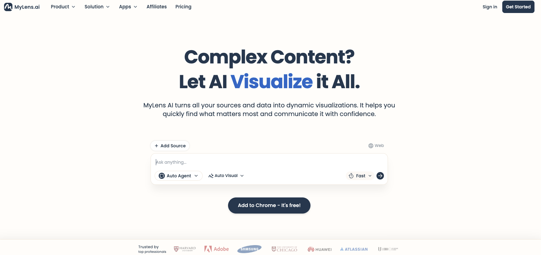
MyLens.AI is a visualization platform that transforms complex documents and research into interactive visual formats. Think of it as a thinking partner that helps you navigate dense information by creating visual maps of the content. You upload PDFs, research reports, or documents, and it generates visual representations—timelines, mind maps, tables, flowcharts—that you can drill down into, edit, and share. The platform uses different "agents" (specialized, deep, wide) to determine how to visualize your content, and it maintains source citations throughout so you can trace insights back to the original material. What makes it particularly useful is the ability to explore progressively—you start with a high-level view, then click into specific sections to generate deeper visualizations. It's less about creating presentation decks and more about giving you a dynamic way to understand and navigate information that would otherwise exist as long-form text.
How to apply MyLens.ai to the business today:
Client meeting preparation: Upload market commentaries, research reports, or economic analyses before client meetings. Generate visual frameworks that help you explain complex market dynamics in clearer terms than reading from dense PDFs.
Internal knowledge management: When you receive lengthy white papers from asset managers or research from partners, visualize them to quickly identify the key points. Share these visualizations with your team so everyone can get up to speed without reading 40-page documents.
Compliance document review: Upload regulatory updates or compliance guidance and create visual breakdowns of requirements. Much easier to ensure your team understands new rules when they're mapped visually rather than buried in paragraphs.
Investment committee preparation: Before investment committee meetings, take multiple research sources on a particular asset class or manager and visualize them together. Helps you spot patterns and contradictions across sources that you might miss reading sequentially.
Client education materials: Transform complex financial planning concepts—Social Security strategies, Medicare decisions, estate planning options—into visual guides. Clients grasp concepts faster when they can see the decision trees and relationships visually.
Advanced:
Research synthesis workflows: Combine MyLens.AI with research tools like Google Gemini or Perplexity. Do deep research on a topic (AI policy changes, semiconductor industry analysis, Fed monetary policy), export to PDF, then visualize in MyLens. Creates a research-to-insight pipeline that's more thorough than either tool alone.
Custom client reporting: Take your quarterly market commentary or investment thesis and visualize it before writing the final client-facing version. Helps you see if your narrative flow makes sense and if you're missing connections between ideas.
Prospect education sequences: Build a library of visualized content on your firm's investment philosophy, planning process, or service model. When prospects ask "how do you approach retirement income?", you can share an interactive visual that they can explore at their own pace rather than sending a PDF they'll never read.
Scenario planning visualization: Upload your own written analyses of different market scenarios or planning strategies and have MyLens create visual decision trees. Particularly useful for showing clients how different choices cascade into different outcomes over time.
Knowledge transfer for succession planning: If you're preparing junior advisors to take over client relationships, visualize your process documentation and client situation summaries. Makes implicit knowledge explicit and easier to transfer than traditional written procedures.
What could this application mean for the future of our business?
The interesting thing about MyLens isn't that it creates pretty pictures—it's that it changes how we can think about and navigate information. Right now, most advisors are swimming in content: research reports, planning software outputs, market commentaries, industry white papers. We either read all of it (impossible) or skim headlines (insufficient). A tool that can take any of that content and make it explorable creates opportunity. You can actually go deep on topics because you're not fighting through dense prose. For clients, this matters because visualization isn't just about making things prettier—it's about matching how different people actually process information. Some clients want the narrative, others want to see the map. We've been limited to delivering information in whatever format it arrives. Now we can translate it. The competitive advantage isn't just having access to good research; it's being able to transform that research into formats that create genuine understanding. As these visualization tools improve, the firms that figure out how to integrate them into their knowledge workflows—not just for client-facing materials, but for internal learning and decision-making—will operate at a different speed than firms still working through everything linearly.
See Mylens.ai in action:
I did a comprehensive research project in Google Gemini on the state of AI infrastructure in the U.S.—the full vertical stack from semiconductors to applications. Got back a detailed report that would take an hour to read carefully. Then I exported it to PDF, uploaded it to MyLens, and watched it create an interactive visualization in seconds. I was then able to click "drill down" on a specific section about AI capital trends, and it generated an entirely new visualization just for that subsection—pulling citations back to the source document. I kept going deeper: foundational layer, semiconductor battleground, custom ASICs. Each click created a new visual map. What would have been 90 minutes of reading and note-taking became 15 minutes of visual exploration where I could actually see how concepts connected. Watch the demo to see how this research-to-visualization workflow could change how you prepare for client conversations, synthesize information, and help your team get up to speed on complex topics.
-Matt

Do you feel that this tool can add value in your business today? |